Images and socionics
Most, if not all socionists would agree that information signals relevant to socionics can be conveyed not only through words, but also through images, sounds, and art. Here we will collect images from the public domain which appear to convey certain types of information or represent the preferences of different quadras or other socionic groups. Good sources of images are Wikipedia, Wikimedia Commons, and personal photographs that you don't mind turning into public property.
- For an approach on preferences shown in art, see Associative theory including nonverbal tests, Associative psychodiagnostics by Olga Tangemann.
Nature
This goat has been captured in a moment of enjoyable, relaxed feeding -- alone, surrounded by an abundance of tasty plants, and unhampered by leashes or any other external requirements. This conveys ![]() .
.
Graphic art
This one (left) is easy! This smiley face is a graphic portrayal of an emotional state. What effect does it have on you? Just look at it for a moment... ethics.
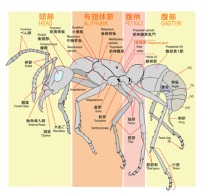
This (right) is a diagram of worker ant morphology. Here we learn the names of all the functional parts of an ant, which helps us to get an idea of how the ant operates. This is logic, and specifically ![]() .
.
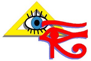
This image (left) conveys primarily intuition (probably ![]() ), because it portrays symbols that bear little resemblance to things seen in the real world (except for the eye), yet have hidden meaning.
), because it portrays symbols that bear little resemblance to things seen in the real world (except for the eye), yet have hidden meaning.
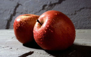
This image (right) conveys sensing information. Care has been taken to portray not a generalized apple, but a very specific apple with a specific texture, color, shape, etc. The image is also dominated by a play of colors, textures, and shadows. Want to take a bite?
Architecture
Stalinist architecture
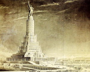
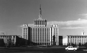
Stalinist architecture is known for its monumentalism and overwhelming, oversized forms. Here are some examples:
Both of these buildings (the one on the left was never built) exhibit an abundance of systematized order (![]() ), with all the symmetry and repeating geometric patterns and lines. The high spikes or towers of the buildings convey a sense of centralized power and might ("everything comes together at this one highest point") (
), with all the symmetry and repeating geometric patterns and lines. The high spikes or towers of the buildings convey a sense of centralized power and might ("everything comes together at this one highest point") (![]() signals). Concentration and mobilization of energy, not relaxation and dissipation!
signals). Concentration and mobilization of energy, not relaxation and dissipation!
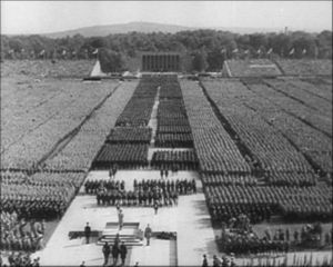
Here is a scene that conveys similar signals, but is not architecture.
One of Hitler's military parades and speeches. Here again you see the very clear structure with repeating patterns and a heavy emphasis on symmetricity, and the elevated center that is the focus of everything.
Brasilia
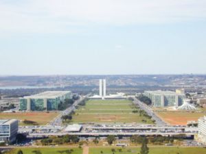
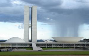
Brazil's capital was completely built from scratch in the late 1950s according to an unified architectural and urban plan. Although today largely "diluted" by later developments, that original plan is still very visible.
The same features as featured above as in Hitler's parade are visible in the design of the main avenue, the heart of the city - symmetrical, repeated forms, culminating in an elevated center (Congress building) clearly indicating the supposed center of power, above the much lower buildings of the supreme court and the president's office, barely visible to its left and right side. However, it is a much milder effect than in any Stalinist building and therefore barely noticed.
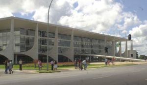
Interestingly, closer looks at the individual buildings of Congress, right, and the presidential palace, below right, show the same concern with symmetrical and repeated forms, but the straight lines are often "softened" by curves and occasional irregularities, suggesting a touch of Gaudi-like irrationality. Also, compared to Stalinistic architecture with its massive foundations, prominent stairs, and tapering towers, these buildings are far less monumental and ponderous.
The main architect, Oscar Niemeyer, had later designs which were much more irrational in that sense. A combination of ![]() symmetry and order, a slight
symmetry and order, a slight ![]() concern about the power center but not visible otherwise, and with plenty of irrationality, all fit well the preferences of the IEI, which is a likely type for Niemeyer himself for many reasons. Finally, the airy aspect of those buildings, with lots of glass and external, non-functional structures, convey intuition. The functionality of all of those buildings is very low; for instance, the glass structure makes them work like greenhouses in the Brasilia summer. Very little concern for
concern about the power center but not visible otherwise, and with plenty of irrationality, all fit well the preferences of the IEI, which is a likely type for Niemeyer himself for many reasons. Finally, the airy aspect of those buildings, with lots of glass and external, non-functional structures, convey intuition. The functionality of all of those buildings is very low; for instance, the glass structure makes them work like greenhouses in the Brasilia summer. Very little concern for ![]() .
.
Antoni Gaudi
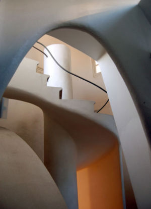
Gaudi is famous for his irregular, organic, fluid structures. Here is an example of an arch and spiral staircase designed by Gaudi.
This style can be characterized as highly irrational. Regularity and predictability are rejected as architectural principles.
Baron Haussmann's renovation of Paris under Napoleon III
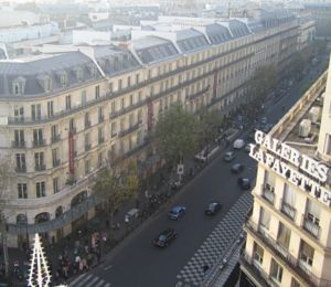
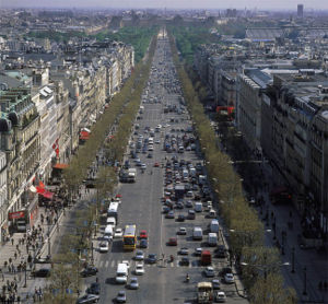
Today's Paris of long, wide boulevards with very uniform architecture in their buildings dates from a massive renovation and rebuilding project under Baron Haussmann in the second half of the 19th century. There is the ![]() symmetrical order in the uniformity of the buildings, but it is "softened" by the artistic details that suggest that it was more meant to convey pleasant
symmetrical order in the uniformity of the buildings, but it is "softened" by the artistic details that suggest that it was more meant to convey pleasant ![]() aesthetic sensations than
aesthetic sensations than ![]() power. Also, in contrast to the monumental Stalinistic architecture above, there is no emphasis on centralization or hierarchy (through the elevation of certain parts above others, tall spikes, long staircases, etc.).
power. Also, in contrast to the monumental Stalinistic architecture above, there is no emphasis on centralization or hierarchy (through the elevation of certain parts above others, tall spikes, long staircases, etc.).
The broad, long boulevards were designed to facilitate traffic, increasing efficiency ![]() . This is illustrated by the fact that only historians associate that architecture with Napoleon III's failed authoritarian regime. A combination of rational
. This is illustrated by the fact that only historians associate that architecture with Napoleon III's failed authoritarian regime. A combination of rational ![]() and
and ![]() designs and
designs and ![]() aesthetic sensations. Probably those most inclined to appreciate it in its entirety are members of the Delta quadra followed by the Alpha quadra. Gammas are likely to be somewhat put off by the over-emphasis on
aesthetic sensations. Probably those most inclined to appreciate it in its entirety are members of the Delta quadra followed by the Alpha quadra. Gammas are likely to be somewhat put off by the over-emphasis on ![]() architectural uniformity and "excessive"
architectural uniformity and "excessive" ![]() details. Betas are likely to find it pretty but unexciting, too "soft". The "Stalinist" character of this project is more visible in the way it was carried out, top-down by a dictatorial government, rather than in the architecture itself.
details. Betas are likely to find it pretty but unexciting, too "soft". The "Stalinist" character of this project is more visible in the way it was carried out, top-down by a dictatorial government, rather than in the architecture itself.
Centre Georges Pompidou (Paris)
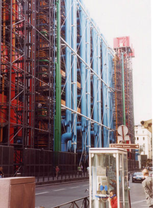
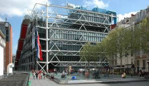
This iconoclastic building in Paris was built in the 1970s. It basically took all the utilities and structural features that always go on the inside of a building and put them on the outside instead.
From Wikipedia:
Reporting on Rogers' winning the Pritzker Prize in 2007, the New York Times noted that the design of the Centre "turned the architecture world upside down" and that "Mr. Rogers earned a reputation as a high-tech iconoclast with the completion of the 1977 Pompidou Center, with its exposed skeleton of brightly colored tubes for mechanical systems. The Pompidou 'revolutionized museums,' the Pritzker jury said, 'transforming what had once been elite monuments into popular places of social and cultural exchange, woven into the heart of the city. The characteristic piping is color-coded according to the contents: yellow for electricity, red for heating, blue for air, and green for water.'
The primary message of this building seems to be ![]() -- an awareness of alternatives and possibilities in the outside world. Why, after all, does the skeleton of a building have to be on the inside, out of sight?
-- an awareness of alternatives and possibilities in the outside world. Why, after all, does the skeleton of a building have to be on the inside, out of sight?
It could be argued that the overt placement of functional components of the building on the exterior reflects a ![]() focus as well.
focus as well.
Sydney Opera House
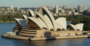
A very different impression is conveyed by the famous Sydney Opera House. The external appearance is shaped by sail-like structures that fulfill no functional purpose; they are meant to transmit the impression of sails, with the opera house as an agglomeration of ships, especially with the water background. The ship image is not obvious, though. This suggests a focus on ![]() imagery rather than
imagery rather than ![]() sensations, although the latter is also visible since the overall image is pleasing even to those who do not catch the ship reference. The indirect reference to ships and flowing forms also suggest irrationality. It can also be suggested that the overal impression is of striking emotions and expression, so a focus on
sensations, although the latter is also visible since the overall image is pleasing even to those who do not catch the ship reference. The indirect reference to ships and flowing forms also suggest irrationality. It can also be suggested that the overal impression is of striking emotions and expression, so a focus on ![]() , definitely a much stronger one than on
, definitely a much stronger one than on ![]() functionality since those structures serve no "practical" purpose at all.
functionality since those structures serve no "practical" purpose at all.
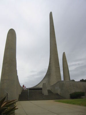
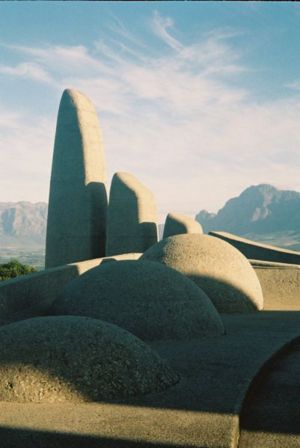
Afrikaans Language Monument
A monument to the Afrikaans language has been built on the hills near the city of Paarl in South Africa, within driving distance from Cape Town. The monument has nearly no straight lines, being based on curves that follow no obvious pattern and have no symmetry. The casual visitor probably can't relate its shapes to any meaning at all.
Yet, all its shapes were meant to connect to one aspect of the Afrikaans language: the influence from European, African and Malayan languages, culminating in the elevating peak of the Afrikaans language. Inside the highest building there is a continuous flow of water.
The irregular shapes are signs of irrationality. The hidden meaning of the buildings, and the solitary, peaceful location of the monument, inviting to inner reflection - all of this means that the monument is mainly ![]() but still with some concern for
but still with some concern for ![]() since the shapes and setting are also soothing and relaxing.
since the shapes and setting are also soothing and relaxing.
Palace of Westminster
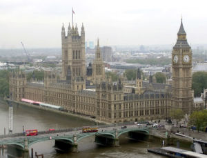
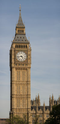
The present buildings of the Houses of Parliament of the United Kingdom date from the Victorian age.
In its shape and design, also in the interior, the building is essentially functional. Its basic retangular shape and regular lines reflect ![]() and all its parts are functional
and all its parts are functional ![]() . There is the convention of making the center of power the tallest structure, but even the highest point is made functional as the Clock Tower. All of this reflects
. There is the convention of making the center of power the tallest structure, but even the highest point is made functional as the Clock Tower. All of this reflects ![]() . The exterior - and the interior - are enriched with decorative details that are regular and symmetrical (
. The exterior - and the interior - are enriched with decorative details that are regular and symmetrical (![]() ); all of that suggests rationality, even as those small decorative details serve no purpose besides making the whole more aesthetically pleasing (
); all of that suggests rationality, even as those small decorative details serve no purpose besides making the whole more aesthetically pleasing (![]() ).
).
Sculpture
Roman imperial image
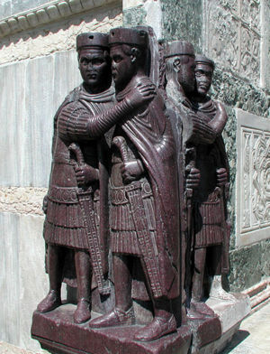
This (right) is a very famous statue of the four Tetrarch rulers of the Roman Empire, now integrated into the side of St Mark's in Venice. Despite the high artistic levels achieved in that time, it can be seen that the main purpose of these statues was not to be pleasing to the eye in a ![]() aesthetic sense. The four statues are not realistic portrayals of the individual emperors (Diocletian, Maximian, Galerius, Constantius) but impersonal, generic and identical portraits. That identity conveys a sense of symmetry and unity of purpose, both
aesthetic sense. The four statues are not realistic portrayals of the individual emperors (Diocletian, Maximian, Galerius, Constantius) but impersonal, generic and identical portraits. That identity conveys a sense of symmetry and unity of purpose, both ![]() and
and ![]() . The stone used was porphyry, an expensive marble reserved for the imperial authority, and that, added to the military posture of the statues, with their hands firmly grasping their swords, further enhances the
. The stone used was porphyry, an expensive marble reserved for the imperial authority, and that, added to the military posture of the statues, with their hands firmly grasping their swords, further enhances the ![]() image of authority. There is no concern about showing the emperors as individuals, or in a benevolent image such as earlier statues of Augustus below, for instance. What these statues are conveying is: it does not matter who the individual emperors are or how they look like as human beings, nor does it matter if these statues look pleasant to the eye. What matters is that the four emperors are united in their military power and wealth. That was an important image since the division of imperial power among four individuals, under a much more authoritarian structure, followed a period of civil war and near-anarchy. The statues are making clear that times have changed.
image of authority. There is no concern about showing the emperors as individuals, or in a benevolent image such as earlier statues of Augustus below, for instance. What these statues are conveying is: it does not matter who the individual emperors are or how they look like as human beings, nor does it matter if these statues look pleasant to the eye. What matters is that the four emperors are united in their military power and wealth. That was an important image since the division of imperial power among four individuals, under a much more authoritarian structure, followed a period of civil war and near-anarchy. The statues are making clear that times have changed.
This statue of the tetrarchs fits well within the Beta quadra, which was also the likely quadra of the leading tetrarch emperor, Diocletian as well as of his colleagues.
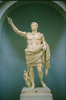
This statue of the first emperor, Augustus (right), was meant to convey a very different image. Augustus is recognizable as an individual, and there is still the concern with conveying ![]() power as per his military attire (although the real person was famously non-military in nature). The statue is refined artistically and pleasing to the eye with a concern for
power as per his military attire (although the real person was famously non-military in nature). The statue is refined artistically and pleasing to the eye with a concern for ![]() , and the emperor's countenance is calm, with just an aura of authority but clearly benevolent, all in an understated way, suggesting
, and the emperor's countenance is calm, with just an aura of authority but clearly benevolent, all in an understated way, suggesting ![]() . This is a guy who wants you to know you can trust him to be your ruler, not someone who wants to rub his power in your face in an intimidating fashion.
. This is a guy who wants you to know you can trust him to be your ruler, not someone who wants to rub his power in your face in an intimidating fashion.
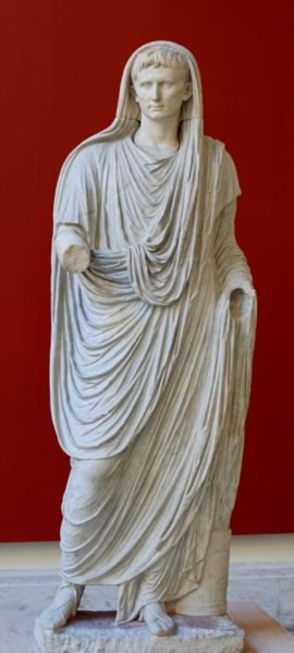
This point is made even clearer in this other statue of Augustus below left:
The non-threatening, benevolent impression transmitted by this statue is even more clear since this has a totally civilian character. Not a sign of ![]() and a great deal of focus on
and a great deal of focus on ![]() on Augustus as a human being and on
on Augustus as a human being and on ![]() due to the relaxed elegance conveyed by it. The contrast with the statues of the tetrarchs above could not be more blatant, yet these are two examples of Roman emperors, of the same civilization; the only difference is in the kind of message that the statues were intended to convey.
due to the relaxed elegance conveyed by it. The contrast with the statues of the tetrarchs above could not be more blatant, yet these are two examples of Roman emperors, of the same civilization; the only difference is in the kind of message that the statues were intended to convey.
These two statues of Augustus are probably most congenial to the Gamma and Delta quadras, and Gamma is a likely quadra for Augustus himself.
Yitzhak Rabin assassination monument
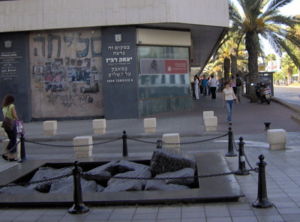
This monument (right) has been built on the precise spot where the Israeli prime minister Yitzhak Rabin was assassinated in 1995. It is remarkable by being "ugly" apparently on purpose; this is a use of "negative" ![]() . Unlike other sculptures whose deeper
. Unlike other sculptures whose deeper ![]() meaning may be lost on the observer, but still be regarded as aesthetically pleasing (such as the Afrikaans Language Monument above), there is nearly no chance that even the casual observer who never heard about Yitzhak Rabin will get positive
meaning may be lost on the observer, but still be regarded as aesthetically pleasing (such as the Afrikaans Language Monument above), there is nearly no chance that even the casual observer who never heard about Yitzhak Rabin will get positive ![]() emotions from this monument. Those who do connect the image and the spot to the event via
emotions from this monument. Those who do connect the image and the spot to the event via ![]() will have a double negative
will have a double negative ![]() effect from both
effect from both ![]() and
and ![]() . And of course, the
. And of course, the ![]() meaning is destruction, both of Rabin's life and of what he was trying to achieve.
meaning is destruction, both of Rabin's life and of what he was trying to achieve.
